

Post by xToTheENDx on Sept 19, 2008 14:40:29 GMT -5
GENERAL TUTORIAL ON MAKING AVATARS
INTRODUCTION
I’ve been asked a lot of questions about my avatars and general avatar-making. There have been people who have expressed an interest for me to make a tutorial and things like that. I feel bad most of the time as when I respond to those questions I never properly answer them, hence I made a tutorial about everything I know about icons.
This tutorial mainly contains my opinions about icons, thus it is not a universal guide to perfect icon-making. Furthermore, I personally don’t think the icons that I make are that special, however I have improved since I first started making icons so I do have some experience. The point I’m trying to make is that I’m not the greatest icon-maker in the world & that people adapt to trends, therefore this is a collection of these trends that I have noticed in the world of icon-making.
DISCLAIMER
All avatars in this post were made by me, unless otherwise stated.
CONTENTS
Text
Cropping
Coloring
Inspiration
Find a style
Comments
Crediting
Final Notes
TEXT
Example:

*Not made by me
CROPPING/COLORING


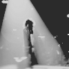
Another note here: notice the coloring? Colors make people happy, and executing a perfect black & white icon is extremely difficult in my opinion. Furthermore, DO NOT use gradients visably. What I mean by this can be seen here:

*Not made by me. Taken from Swimchick.net
It's is very obvious that this icon has been "coated" with a gradient improperly, and thus looks washed out. Gradients can be used well, and often can greatly enhance an image. Examples:


INSPIRATION
Recently I found this icon:
*Not made by me
And used it as inspiration for this:

See? They are similar but different because they were used as inspiration only. I have used a different fandom and have created a non-identical icon although the icon I have made is clearly inspired by the style!
This is majorly important as it can make icon-makers very annoyed. For example, take this icon:
*Not made by me
Par exemple, copying would be taking that exact same style and using an image from the same fandom (most likely). That is copying, and you just don’t do it. The keyword here is inspiration.
FIND YOUR STYLE
HOW DO I GET MORE COMMENTS?
Okay...pause. Comments? Alright, a few people have been concerned with the comments they are receiving on icon-posts & how to receive more comments. Firstly, I want to be honest with everyone, the more comments you receive the more beautiful your icons are or it's due to the more friends you have.
Secondly, I personally make icons for enjoyment, it's the way I relax. Obviously I post my icons on forums and such because I want to know what people think about them. I want feedback because I want to know how to improve. Thus, wanting feedback IS receiving comments. So, the question we are asking here is:
That sounds a lot more diplomatic and proper than "I want more people to comment."
So, these are the "commenting" trends I have noticed.
CREDITING
TUTORIALS
Why I rarely follow tutorials:
Tutorials can be a great way to get off to a good start and to expand your style, but don't become too dependant on them. Invent your own effects!
FINAL NOTES
Coming up next - another coloring tutorial, for this effect:

If you have any questions, don't hesitate to ask.
INTRODUCTION
I’ve been asked a lot of questions about my avatars and general avatar-making. There have been people who have expressed an interest for me to make a tutorial and things like that. I feel bad most of the time as when I respond to those questions I never properly answer them, hence I made a tutorial about everything I know about icons.
This tutorial mainly contains my opinions about icons, thus it is not a universal guide to perfect icon-making. Furthermore, I personally don’t think the icons that I make are that special, however I have improved since I first started making icons so I do have some experience. The point I’m trying to make is that I’m not the greatest icon-maker in the world & that people adapt to trends, therefore this is a collection of these trends that I have noticed in the world of icon-making.
DISCLAIMER
All avatars in this post were made by me, unless otherwise stated.
CONTENTS
Text
Cropping
Coloring
Inspiration
Find a style
Comments
Crediting
Final Notes
TEXT
- In my opinion you should only use text when necessary - sometimes even tiny text can take away from the image. My advice here is to rarely use text.
- Of course, don’t move away from the idea to never use text again; as some people have mastered it! That is, they have used it appropriately OR they have chosen/thought of a very funny quote.
Example:
*Not made by me
- The typical fonts that I use on icons are:
Lane - Narrow, Print Clearly, Arial, and Times New Roman
CROPPING/COLORING
- Interesting cropping is vital, and honestly it is not that difficult to master.
- The only advice I have here is that when you produce a batch of icons, combine unusual cropping with regular cropping.
Examples:
Another note here: notice the coloring? Colors make people happy, and executing a perfect black & white icon is extremely difficult in my opinion. Furthermore, DO NOT use gradients visably. What I mean by this can be seen here:
*Not made by me. Taken from Swimchick.net
It's is very obvious that this icon has been "coated" with a gradient improperly, and thus looks washed out. Gradients can be used well, and often can greatly enhance an image. Examples:
INSPIRATION
- The best way to improve your icon skills is to find an icon-style that you like. Use those icons as inspiration because this is what professional designers do in the industry, and thus it progresses this world of design or rather icon-making.
- Examples from myself:
Recently I found this icon:
*Not made by me
And used it as inspiration for this:
See? They are similar but different because they were used as inspiration only. I have used a different fandom and have created a non-identical icon although the icon I have made is clearly inspired by the style!
- DON’T COPY!
This is majorly important as it can make icon-makers very annoyed. For example, take this icon:
*Not made by me
Par exemple, copying would be taking that exact same style and using an image from the same fandom (most likely). That is copying, and you just don’t do it. The keyword here is inspiration.
FIND YOUR STYLE
- Successful icon-makers do not stick to one effect.
- Do not, necessarily, follow trends. Try to be different and creative.
HOW DO I GET MORE COMMENTS?
Okay...pause. Comments? Alright, a few people have been concerned with the comments they are receiving on icon-posts & how to receive more comments. Firstly, I want to be honest with everyone, the more comments you receive the more beautiful your icons are or it's due to the more friends you have.
Secondly, I personally make icons for enjoyment, it's the way I relax. Obviously I post my icons on forums and such because I want to know what people think about them. I want feedback because I want to know how to improve. Thus, wanting feedback IS receiving comments. So, the question we are asking here is:
- How do I receive more constructive criticism or opinions about my icons?
That sounds a lot more diplomatic and proper than "I want more people to comment."
So, these are the "commenting" trends I have noticed.
- Make a lot of icons for one post.
- Do a post which focuses on many different fandoms.
- Also remember your icons need to be pretty to receive comments; as no one is willing to leave you a bad comment or an opinionated comment, as this can sometimes be considered as unacceptable by most icon makers.
- MAKE FRIENDS! Your friends will sometimes give you the sympathy vote and leave a comment for you.
CREDITING
- Credit the icon maker who made the icon, not the community or forum in which you found it in.
TUTORIALS
Why I rarely follow tutorials:
- when I make icons I don't follow a set pattern or procedure; I go off and play around with all the buttons and options until I get something that I like.
- NOT EVERY TUTORIAL WORKS FOR EVERY PICTURE. This is vital to remember, you need to mess around with things a bit.
Tutorials can be a great way to get off to a good start and to expand your style, but don't become too dependant on them. Invent your own effects!
FINAL NOTES
- It's best to stay away from brushes.
- Use clear, simple, but pretty fonts.
- Save your icons as .png when possible, this is allows for the icon to remain high quality. Never use .jpeg. Ever.
- This tutorial took me exactly four hours to put together, if you could comment to say that you read it, or somehow let me know if you took something from it, it would be very much appreciated!
Coming up next - another coloring tutorial, for this effect:
If you have any questions, don't hesitate to ask.